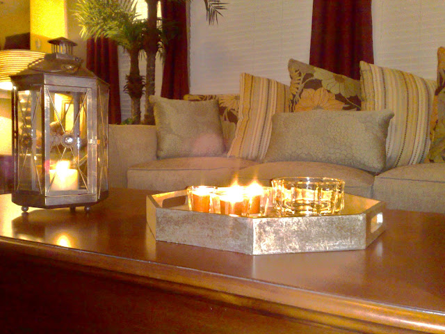
We enjoyed working with Gladys and EC in their beautiful home. This room had all the potential needed to fulfill the perfect space for this family. Utilizing the stock pile of collected accessories and shopping for the right furniture and additional beautiful things, we came up with a room of their dreams.
Before:
After:
The empty niches were screaming for custom built ins. Once done, they look as if they have been there forever. We added the custom shelving and storage cabinets.
Before:
After:
This awkward little area was a bit of a challenge. We decided on some vintage elements to give the space a touch of "what's in" in 2012.
Before:
After:
Left wall space looked out of place until styled.
Before:
After:
Per client's choice, we have lots of furniture to occomodate entertaining,
giving guest adequate comfortable seating.
The Mantel was everything but the emphasis in the room.
Love the new art piece used now and the asymmetrical decor.
Before:
After:
A few masculine touches were chosen to design for both sexes.
The original art helped to pull in the color scheme.
A view from the second floor.
This was a fun day of shopping with our client.
Thank you Gladys and EC for allowing me to post photos of your new space!!
See Review From Gladys and EC Here.
See Review From Gladys and EC Here.

.jpg)


No comments:
Post a Comment