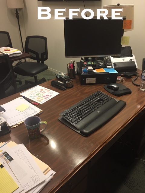
We were very happy to take on the challenge of this office located 15 minutes from the Galleria area.
With a new space plan, improved lighting in the existing can and florescent fixtures, this space instantly started moving towards a much more functional and balanced space.
Below, was the first view of this office when entering. As you can see, the large printer was the main focal point. This is actually a pretty small office with a lot of furniture pieces and the space plan was just not balanced.
Here is a pano view of the newly designed space. Just to the left of the tall bookcases will be a new MCM channeled barrel chair in the tangerine color. It will soften this once dark colorless office space. Now, the space plan and decor has life and is much more functional, balanced and pleasing.
This Matisse art piece became our inspiration for the entire space. Note, we pulled out some of the colors in this art.
Maintenance still will be coming to touch up paint and repair any old nail holes. We are also adding a basket to house cords to make a bit more discreet.
Thank you Gracie for allowing me to post photos of your makeover!


